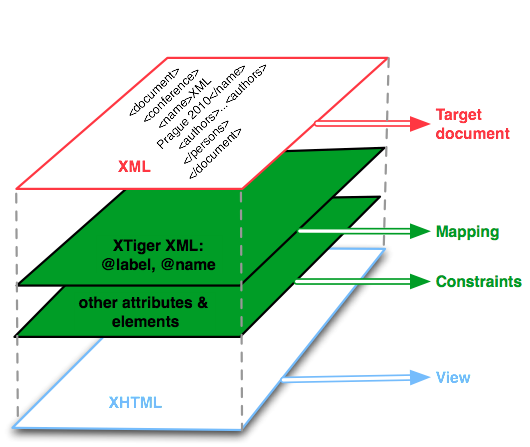
Layered view of an XTiger XML document
Updated: May 10, 2013; Editor: Stéphane Sire (Oppidoc and Media research group)
You should have a reasonable understanding of XHTML and XML to be able to read this document. You are strongly encouraged to try the primitive editors described in this document by opening some template documents inside the AXEL demonstration editor which is available online. This specifiation itself is maintained in a GitHub repository using an XTiger template and an editor built with AXEL. The latest version is published at http://ssire.github.com/xtiger-xml-spec/.
XTiger XML defines several XML elements and their attributes which can be mixed on a host document using the xt: prefix associated with the "http://ns.inria.org/xtiger" namespace. Note that this namespace was first introduced at INRIA for an XTiger language that is a precursor of XTiger XML. The rest of this document will use the term XTiger for XTiger XML.
The combination of XTiger with an host document forms a template document. Such a document can be processed by an XTiger processing engine for different purposes.
The purpose of a template document is to describe a visual presentation for a document that will be used to edit XML data. This is similar to a formular. When the template document is processed with an adequate engine it becomes interactive and the user can enter data. The processing engine is also able to load XML data into the template and to save back XML data from the template.
Currently there is one XTiger processing engine called AXEL (Adaptable XML Editing Library). It transforms template documents hosted on an XHTML document into XML authoring applications. You can name the template document with any suffix, but it is wised to name it with an ".html" or a ".xhtml" suffix to be able to open it directly inside a browser. Note that if you open it without transforming it you may only see parts of it.
The figure below summarizes the languages involved in a template document : the host language (XHTML) serves a a view to generate a document form, some XTiger attributes and elements define some contraints driving the evolution of the structure of the host document while editing, two XTiger attributes (label and name) define a mapping from the document form to a target XML content model that a linearization algorithm can generate at any time.
Layered view of an XTiger XML document
In summary, when writing an XTiger XML template document, you should have on one hand an idea of the XML Content Model you want to edit, and on the other hand an idea of a presentation document based on XHTML that you would like your formatted data looks like. The processing engine will transform some of the XTiger elements embedded inside the XHTML template into dynamical data entry fields that will allow to edit the document and to save the edited data to XML when finished. This is what we call pseudo-WYSIWIG editing.
A typical XTiger document looks like the following simple "hello world" document template below:
<?xml version="1.0" encoding="UTF-8"?>
<html xmlns="http://www.w3.org/1999/xhtml" xmlns:xt="http://ns.inria.org/xtiger">
<head>
 <title>My first template</title>
 <xt:head label="greetings">
   <xt:component name="t_friend">
     <li><xt:use types="text">name</xt:use><xt:menu-marker/></li>
   </xt:component>
 </xt:head>
</head>
<body>
 <p>List of persons to great:</p>
 <ul>
   <xt:repeat minOccurs="0" maxOccurs="*" label="persons">
     <xt:use types="t_friend" label="name"/>
   </xt:repeat>
 </ul>
</body>
</html>
As you can see, it contains two parts:
The example above declares a single component type named friend. This component type is included in the body section where it can be repeated between zero and a non limited number of times. Consequently, when used to enter data, the previous template can produce the following target XML document:
<greetings>
  <persons/>
</greetings>
or this one:
<greetings>
  <persons>
    <name>Charlie</name>
    <name>Oscar<name>
  </persons>
</greetings>
The mapping between the document template and the target XML content model is controlled with two attributes (in green in the document example above):
In the document template above you may also notice a xt:menu-marker element. This element is just a hint given to the XTiger processor for placing the Add / Remove buttons that will be generated to control the repetition inside the xt:repeat element. In the document above these buttons will be inserted in place of the xt:menu-marker, which means at the end of the li element. This way, they will appear at the end of the line and not on a new line, which would break the document layout. This type of hint if precious for the XTiger processor as it allows to keep a more natural document appearance when editing data.
XTiger defines a set of built-in component types which are ultimately mapped to editable user interface text input fields. These built-in component types allow the user to enter or to modify data into the document. Consequently a template document that does not reference any built-in component type will not allow users to input new data, at most it will allow users to repeat static parts of the document, to change their order or to choose between different parts, which is not quite useful.
The built-in component types are included in the template document with an xt:use element with a pre-defined types attribute set to the unique type name of the built-in component. For instance the following declaration <xt:use types="text">name</xt:use/> includes a text editor that can be used to input a name, as suggested by its default value which is put in the element content.
An XTiger processor component library can be extended with new built-in components. This is usually done by creating a Javascript plugin which has to register it's type name to the library. This way it is possible to create many different editing interaction styles by using different plugin editors. For instance a common use of plugin editors is to create editors that constrain the input data, such as entering a date, or a number, uploading an image, etc.
An XTiger processor should at least implement 2 primitive component types: text and select. They will be described below.
Contains xt:component
Contained in head (XHTML)
The xt:head element contains the component types declaration section of the template document. It must be present even if it is empty.
| Name | Mandatory | Value | Definition |
|---|---|---|---|
| label | no | any string, defaults to instance if not defined | defines the tag name for the root element of the target XML content model of the template |
Currently XTiger XML does not interpret the other attributes for this element which are defined in the original XTiger specification.
<?xml version="1.0" encoding="UTF-8"?>
<html xmlns="http://www.w3.org/1999/xhtml" xmlns:xt="http://ns.inria.org/xtiger">
<head>
  <xt:head label="test"/>
</head>
<body>
  <p>Empty</p>
</body>
</html>
The template above generates only one XML content model:
<test/>
Contains any XHTML content, xt:use, xt:repeat, xt:attribute, xt:menu-marker
Contained in xt:head
The xt:component element declares a new component type which can be included later on with an xt:use element. The content of the component may be any regular XHTML, or it can includes other XTiger elements or both. The creation of nested components can be achieved by including other components within a component through one or more xt:use elements. This will also create nested XML data structures as the xt:use elements can be mapped to a tag name in the XML content model of the template (see below).
An xt:component may contain one or several optional xt:menu-marker elements. Each one is significant only if it is included within the scope of an xt:repeat element. In that case the xt:menu-marker element will be replaced by the user interface widget(s) for the repetition menu.
| Name | Mandatory | Value | Definition |
|---|---|---|---|
| name | yes | string | name for component type, it must be unique within all the components of a template document and it is used to insert the component with an xt:use element |
| i18n | no | string | label that is displayed for the option that represents the inclusion of this component in the menu generated in case of a xt:use element that references multiple types; this is used for internationalization purposes of a template document |
modifier l'exemple pour illustrer menu-marker, prendre les keywords dans un article
<?xml version="1.0" encoding="UTF-8"?>
<html xmlns="http://www.w3.org/1999/xhtml" xmlns:xt="http://ns.inria.org/xtiger">
 <xt:head>
  <xt:component name="t_introduction">
   <p>I was born the <xt:use types="string" label="date">day of month, year <xt:use>
in <xt:use types="string" label="place">city</xt:use></p>
  <xt:component>
 </xt:head>
</head>
<body>
 <h2>Presentation of <xt:use types="text" label="name" param="shape=parent">name</xt:use></h2>
 <xt:use types="t_introduction" label="birth"/>
</body>
</html>
Contains empty, or text node
Contained in xt:component, xt:repeat or any XHTML element that can have child elements
The xt:use element includes a component inside the document. It may include a single component type, a primitive component type, or a list of component types.
This is the case when the types attribute contains the name of a component type which is declared by an xt:component element of the same name in the xt:head section of the template document. That inclusion will be treated by generating the component type's content in place of the xt:use element.
The optional label attribute defines the name of the target XML element to generate in the target document. If it is not defined it is inherited by the context. The xt:use element in this role should have an empty content.
This is the case when the types attribute contains the name of a builtin component type. The list of builtin component types is dependent of the plugins defined by the XTiger processor, however the specification require to implement at least a text and a select primitive editor plugins.
The optional label attribute defines the name of the target XML element to generate in the target document. If it is not defined it is inherited by the context. The content of the xt:use element in this role is not defined per the specification. It should serve as a default content to initialize the primitive editor plugin. It is a good practice to set a self-explanatory default content that hints the user about the expected content
This is the case when the types attribute contains a list of names of component types. For simplifying implementations, the list may be restricted to exclude any builtin component type.
The xt:use in this role generates a selection menu allowing the user to choose the component type to include at runtime. The current selection will define which component's content will replace the xt:use element. Unless using the xt:menu-marker to position the selection menu (see the explanations in the corresponding section), this menu is generated as a previous sibling of the current component's content.
The target content generated by this type of component inclusion is always enclosed inside an XML element baring the name of the current component selection. For instance, if the xt:head section define some parag, list and figure components :
<xt:use types="para list figure"/>
will generate one of the three :
<para>...</para>
or <list>...</list>
or <figure>...</figure>
target XML content. However it is possible to enclose the target XML content inside a parent XML element using a label attribute, as with the other cases. For instance :
<xt:use types="para list figure" label="definition"/>
will generate one of the three :
<definition><para>...</para></definition>
or <defnition><list>...</list></defnition>
or <defnition><figure>...</figure></defnition>
Finally if the label attribute contains a list of names instead of a single name, each name in the list will be matched with the corresponding name in the types list of names, and it will be used to generate the target XML element instead. Both lists must have the same size. For instance :
<xt:use types="para list figure" label="DefPara DefList DefFig"/>
will generate one of the three :
<DefPara>...</DefPara>
or <DefList>...</DefList>
or <DefFig>...</DefFig>
The xt:use element in this role should have an empty content.
The names that will appear in the selection menu will be either the component type names (e.g. above para, list or figure), the component names as defined per the label attribute if it is used to rename the target XML content tag names (e.g. above DefPara, DefList, DefFig), or the component name given by its i18n attribute if it has one. The i18n attribute supersedes any other choice.
The xt:use element that includes a primitive component type may declare an optional handle attribute. This attribute is set to the name of a preferred XHTML element that should be used as a handle by the primitive editor plugin. This is mostly targeted at a text editing plugins that use a default span handle, to change that for a block-level handle that may be preferrable with some filters.
| Name | Mandatory | Value | Definition |
|---|---|---|---|
| types | yes | list of white space separated type names | lists the components which can be included at the position of the xt:use, if there are several names the XTiger processor will generate a selection menu |
| label | no | string | mapping with a tag name in the XML content model |
| option | no | set or unset | if this attribute is present, the xt:use content is optional, when its value is "set" the content is set by default whereas it is not set if its value is "unset" NOTE: actually option is interpreted if and only if types integrates a single primitive component type |
| handle | no | XHTML tag name | changes the default handle created by a primitive editor plugin to a specific one; note that this is plugin implementation dependent |
| param | no | list of semi-colon separated key=value pairs | declares some options which can be set for the primitive editor that will manage the component included with this xt:use; this attribute is only taken into account 1) if the xt:use contains only one type name in the types attribute and ii) if this is the type name of a registered primitive editor |
<?xml version="1.0" encoding="UTF-8"?>
<html xmlns="http://www.w3.org/1999/xhtml" xmlns:xt="http://ns.inria.org/xtiger">
 <xt:head label="presentation">
 <xt:component name="intro">
   <p>I was born the <xt:use types="string"label="date">day of month, year <xt:use>
in <xt:use types="string"label="place">city</xt:use></p>
 </xt:component>
 </xt:head>
</head>
<body>
 <h2>Presentation of <xt:use types="text"label="name" param="shape=parent">name</xt:use>
 </h2>
 <xt:use types="intro"label="birth"/>
</body>
</html>
The template above will generate the following type of XML data:
<presentation>
  <name/>
  <birth>
    <date/>
    <place/>
  </birth>
</presentation>
You may have notice that the previous example is not completely internationalized, as some text inside the template itself, which is not part of the XML content model, such as the <h2> sub-title Presentation of , should also be internationalized. This is out of the scope of this specifciation. This can be chieved using different templating mechanisms that depend of the server-side framework used to serve the templates themselves.
Contains emtpy or text node
Contained in descendant of an xt:component or an xt:repeat element
The xt:attribute element includes a built-in component type that will be mapped to an XML attribute in the XML content model of the document. This XML attribute will be attached to the current XML element in scope when generating the XML data. The component type name is given in the types attribute, which although in a plural form must contain only one component type name.
| Name | Mandatory | Value | Definition |
|---|---|---|---|
| types | yes | a primitive component type | sets the built-in editor that will be used to edit the attribute; this is restricted to a primitive component type editor (e.g. text or select) |
| name | yes | string | mapping withn an attribute name in the target XML content model |
| option | no | set or unset | if this attribute is present, the xt:attribute is optional, when its value is "set" it is set by default whereas it is not set if its value is "unset" |
| values | no | optional white space separated list of the values allowed for the attribute | defines a list of allowed values for the attribute, this only applies with a primitive component type that manages a list of choices (i.e. at that moment this is the case only with the select primitive component type) |
| default | yes | string | if the attribute value is defined by a list of values, then the default one must be defined by this attribute |
| i18n | no | optional white space separated list of the labels to display for each value in the values attribute | if the attribute value is defined by a list of values, then it gives a list of corresponding labels for each value in the menu that presents the allowed values to the user; if present, the order of the labels in this list must be the same as the order of the corresponding values |
| handle | no | XHTML tag name | changes the default handle created by a primitive editor plugin to a specific one; note that this is plugin implementation dependent (same as for xt:use) |
| param | no | list of semi-colon separated key=value pairs | declares some primitive editor's dependent options |
<?xml version="1.0" encoding="UTF-8"?>
<html xmlns="http://www.w3.org/1999/xhtml" xmlns:xt="http://ns.inria.org/xtiger">
 <xt:head label="book">
 <xt:component name="author">
	<p>My name is <xt:use types="text" label="name">your name<xt:use>,
but you can call me <xt:attribute types="text" name="nickname">your nickname</xt:attribute></p>
 </xt:component>
 </xt:head>
</head>
<body>
 <xt:use types="author" label="author"/>
</body>
</html>
The extract above will generate the following type of XML data:
<book>
  <author nickname="your nickname">
    <name>your name</name>
  </author>
</book
Contains empty
Contained in descendant of an xt:component or an xt:repeat element
The xt:menu-marker element must be placed inside the scope of an xt:repeat element (either as a direct descendant or as a descendant after one or more type inclusions through xt:use elements). It controls the insertion point of the Add / Remove buttons generated by the XTiger processor when transforming the xt:repeat element. For instance in the following list component :
<xt:component name="list">
  <ul>
    <xt:repeat minOccurs="1" maxOccurs="*" label="list"/>
       <li>click to enter an item <xt:menu-marker/></li>
    </xt:repeat>
  </ul>
</xt:component>
The repetition Add / Remove buttons must be generated as the last child of each li element, whereas without any xt:menu-marker set, they would be generated as first child of the repeated fragments, which means just before each li element.
The xt:menu-marker element can also be used to control the insertion point of the selection menu generated by an xt:use element contained in the same xt:component. For that purpose the xt:use element must declare in a param attribute a name parameter that serves as an identifier. That identifier must also be set as the value of the target attribute of the xt:menu marker.
For instance the following component contains two xt:menu-marker elements. The one without a target attribute will be used to insert the Add / Remove buttons of it's enclosing xt:repeat element as described above. The one with a target attribute will be used to insert the selection menu for the xt:use with a choice of multiple component types :
<xt:component name="section">
  <xt:repeat minOccurs="1" maxOccurs="*" label="section">
    <div class="row">
      <div class="menu">
        <xt:menu-marker target="t_select"/><br/>
        <xt:menu-marker/>
      </div>
      <xt:use types="parag list title1 title2" param="name=t_select"/>
    </div>
  </xt:repeat>
</xt:component>
Together with a proper choice of class names and CSS rules, this is a convenient way to group repetition and selection menus, and to control the position of those menus to improve user interaction.
| Name | Mandatory | Value | Definition |
|---|---|---|---|
| size | no | an integer (e.g. 20, default to 16) | optional size in pixels for the buttons; it's interpretation is implementation dependent |
| target | no | name of a named xt:use | the xt:menu-marker will be used to display the selection menu for a named xt:use element declared within the same xt:component |
Contains any XHTML content, xt:use, xt:repeat, xt:attribute, xt:menu-marker
Contained in any XHTML element that can have child elements, xt:component, or another xt:repeat
The xt:repeat element defines a document fragment that can be repeated zero or more times. A zero time repetition means that the fragment is optional and is not set. The xt:repeat element will generate some interaction element (a pair of Add / Remove buttons) that will be inserted in place of the first xt:menu-marker element inside the fragment, or inserted at the end of the fragment if it doesn't contain any.
The xt:repeat element can be mapped to a tag name in the XML content model through a label attribute, in a way similar to the xt:use element. If it is not associated with a tag name, it must declare in a pseudoLabel attribute the list of the names of the first tag names that may appear first in the target XML content model. This is mandatory to allow the XTiger processor to correctly load XML data into the template.
| Name | Mandatory | Value | Definition |
|---|---|---|---|
| minOccurs | no | integer (defaults to 0) | minimum number of inclusions of the content fragment in the document, 0 means it is optional (currently the only supported values are 0 or 1) |
| maxOccurs | no | integer or * (defaults to *) | maximum number of inclusions of the content fragment in the document, * means there is no limit (currently the only supported value are 1 or *) |
| label | yes (unless pseudoLabel is defined) | string | mapping with a tag name in the XML content model |
| pseudoLabel | yes (unless label is defined) | string | in case label is not defined on the xt:repeat, it must contains a list of the names of the first XML tag names that may appear in first position in the repeated target XML content model |
<?xml version="1.0" encoding="UTF-8"?>
<html xmlns="http://www.w3.org/1999/xhtml" xmlns:xt="http://ns.inria.org/xtiger">
<head>
 <xt:head label="menucard">
    <xt:component name="dish">
      <p><xt:menu-marker/><xt:use types="text">dish</xt:use>
costs <xt:attribute types="text" name="price" default="00"/> euros</p>
    </xt:component>
 </xt:head>
</head>
<body>
 <h2>Restaurant Menu Card</h2>
 <xt:repeat minOccurs="0" maxOccurs="*"pseudoLabel="dish">
   <xt:use types="dish" label="dish"/>
 </xt:repeat>
</body>
</html>
The extract above will generate the following type of XML data:
<menucard>
 <dish price="20">Chicken and fries</dish>
 <dish price="30">Noodles and salmon</dish>
 <dish price="15">Rice and pork</dish>
</menucard>
Synopsis
<xt:use types="text" label="parag" param="type=textarea;layout=float">
Write a new paragraph here.</xt:use>
<xt:attribute types="text" name="birthdate" default="year"
param="type=input;layout=placed;expansion=none" option="set"/>
The text primitive component type is associated with a text editor that generates a span in the document and either an input field or a textarea field (for multilines entry) in the document. The difference with the string editor is that the input or the textarea fields are shared between all the text primitive editors which are created inside the document.
The text editor supports two types of input or textarea fields with different layout. The float layout dynamically positions the input or the textarea on top of the content to edit when the user clicks on it (using CSS absolute positioning). The placed layout dynamically replaces the content to edit, which is stored in a span, by the input or the textarea field when the user clicks on the content. Once the editing is finished, a float field is hidden revealing the content span which is updated with the last entry; similarly, a placed field is replaced back with the content span.
The text editor supports the option attribute of the xt:use or xt:attribute element that includes it. If this attribute is present it generates a checkbox from which the user can include its content into the document or not.
The content of this editor is initialized to the text content of the xt:use element, or to the value of the default attribute of the xt:attribute element.
The text editor is controlled by passing a list of option declarations into the param attribute on the XTiger element that includes it into the document. For instance the example in the synopsis creates a text editor with a shared textarea and a float layout.
| Parameter | Values | Description |
|---|---|---|
| type | 'input' (default) | the edit field is an <input> (shared at the document level between all the instances) |
| type | 'textarea' | the edit field is a <textarea> (shared at the document level between all the instances) |
| layout | 'placed' (default) | the edit field is inserted dynamically into the DOM instead of the <span> handle |
| layout | 'float' | the edit field is placed dynamically on top of the <span> handle using CSS absolute positioning |
| shape | 'self' (default) | the shape/length of the edit field equals the current shape of the handle |
| shape | 'parent' | the shape of the edit field equals the current shape of the parent of the handle |
| class | string | a class name to set on the handle (e.g. span) that displays the editor content; it must also be set on the entry field when editing |
| expansion | 'grow' (default) | the edit field expands as the user types text; the direction of the expansion may depend on the implementation of the primitive editor and on the 'shape' parameter too, for instance an edit field implemented as an <input> can only grow horizontally, while an edit field implemented as a <textarea> will grow horizontally if its shape is set to 'self' and vertically if its shape is set to 'parent' |
| expansion | 'none' | the edit field has a fixed shape/length |
The text plugin should position the cursor at the character under the mouse when switching to edit mode.
Synopsis
<xt:attribute types="select" label="country" default="Switzerland"
values="France Italy Switzerland"/>
<xt:attribute types="select" label="currency" default="EUR"
values="EUR USD CHF" i18n="Euro Dollars Franc-Suisse"/>
or alternatively :
<xt:use types="select" label="currency"
values="EUR USD CHF" i18n="Euro Dollars Franc-Suisse">EUR</xt:use>
The select primitive component type is associated with a popup menu editor that generates a span in the document that contains a current selection. The popup menu is displayed each time the user clicks on the span and it updates its value to the selected value.
The select editor supports the option attribute of its host element. If this attribute is present it generates a checkbox from which the user can include its content into the document or not.
The select primitive component is mainly associated with an xt:attribute element because it uses its values attribute (and optionaly its i18n attribute) to build the options of the popup menu, and it gets the option selected by default from its default attribute. However it is tolerated than an implementation supports the select plugin with an xt:use element. In that case it will extend its definition to support a values and an i18n attributes, however the selected option by default will be declared in the text content of the xt:use.
This editor does not currently manage any parameter in the param attribute.
The AXEL (Adaptable XML Editing Library) XTiger processor is implemented as a Javascript client-side library. You have the choice to import this Javascript library directly into the template file, using script tags, to make it an auto-editable template. As an alternative you can use an editing application. Such applications can be built with the library. They should allow to load templates and to edit documents with them. They should allow to load XML data into the documents and to save back the document to XML data. Editing applications may load the template to transform inside an iframe, or they can use an XHR request and transform the template inside a target div element. This is explained in a tutorial coming with the library.
The Javascript processor takes as input a template document. It's invocation should start by a rendering process to generate the editor. Then it should expose, using an API, a generation process, to linearize the current editor's content into XML, and optionally a loading process, to replace current editor's content with external XML data.
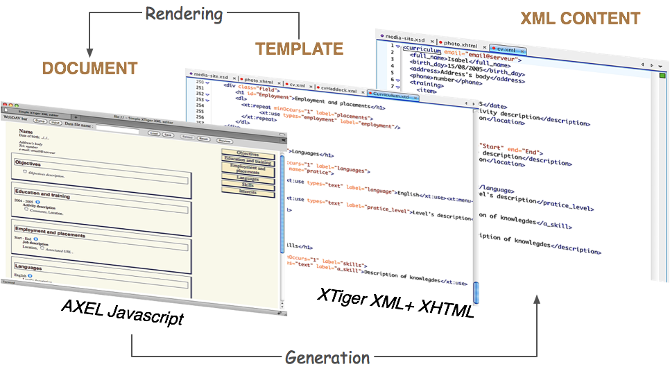
AXEL processing model
The rendering process should load the template document into the browser memory and then transforms it, removing the XTiger elements and generating adequate XHTML content to turn the document into an interactive editable document. During this transformation the processor creates some Javascript objects to control user's input and the dynamic display of user interaction elements (e.g. buttons, popup menus, etc.).
The AXEL XTiger processor engine generates some pre-defined CSS class names while transforming a template document. These are used to style the generated editing application. Most of the time, as a document template author, you will use the standard axel.css file which is distributed with AXEL (path: axel/axel.css). But you may also redefine some of these rules or override them using an !important CSS instruction.These CSS class names are described in the table below.
The most interesting class name is axel-core-editable which is set on the handle of primitive editors. It can be used for instance to improve feedback about the editable fields by using :hover pseudo selectors.
For convenience, the CSS rules are defined in two different files in the AXEL source code distribution, these two files are concatenated to form the axel/css file when you build the library from source:
The next table gives a few example of common CSS selectors set by the library, have a look at the second part of the axel.css (or to stylesheets/axel-style.ss) file to see all of them.
| Source | Class (or selector) | Description |
|---|---|---|
| internal | axel-generator-error | highlights fragments generated from an XTiger template when some error occurred during the transformation process |
| xt:repeat element | axel-repeat-left | left image button (delete) |
| idem | axel-repeat-right | right image button (add) |
| text primitive editor | axel-core-editable | set on the handle (usually a <span>) that contains some editable text |
| any editor made optional with the option attribute | axel-option-checkbox | checkbox image |
| idem | axel-option-set | set on the handle of an optional editor which is set |
| idem | axel-option-unset | set on the handle of an optional editor which is unset |
| select primitive editor | axel-popup-container | <div> container for the popup menu |
| idem | .axel-popup-container li.selected | current selected item in the popup menu |
| idem | .axel-popup-container li.selectable | item that may be selected in the popup menu |
| XTiger element | Attributes (bold if mandatory) | Values for ''types'' | ''option'' attribute | "handle" attribute |
|---|---|---|---|---|
| xt:use | types, label, option, handle, param | text | supported | supported |
| - | - | select | supported | no |
| - | - | single component type defined in the xt:head section | no (use a xt:repeat with maxOccurs="1") | no |
| - | - | list of component types | (use a xt:repeat with maxOccurs="1") | no |
| xt:attribute | types, name, option, handle, param, default, values, i18n (NOTE: the last 3 are only used with types set to select) | text | supported | supported |
| - | - | select | supported | no |
| Primitive component type | Allowed in | Key | Value (default) |
|---|---|---|---|
| text | xt:use, xt:attribute | type | input, textarea (input) |
| - | - | shape | parent[-NBpx], self (self) |
| - | - | layout | float, placed (placed) |
| - | - | class | class name |
| - | - | expansion | grow, none (grow) |
| select | xt:attribute | N/A | N/A |
The "string" primitive editor has been removed on May 10, 2013. It is superseded by the "text" primitive editor.
The "flow" attribute has been removed on May 10, 2013. It has been deprecated to simplify XTiger implementations, and because it can be replaced with server-side code to aggregate / dispatch document fragments from / to multiple sources.